Showing posts with label BOY. Show all posts
boy, shophouse research, sapan-kwai shophouse
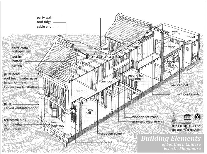
^The specific shophouse i'm doing
@ Pradipat Road, Sapankwai, Bangkok.
There are many different types of facades even there are along in the same road path. Some has big advertisement covered, some has cages and some are sunlight screen. Also want to emphasize the roofs which they are quite different from each other.
some reference pictures from internet, looking and comparing other type or style of shophouses
Boy, documentation and post-analysis on "Green breeze"
what you understand 'erotic' to mean and how your projects experiments with your definition of the erotic as it pertains to architecture?
Erotic to me, it means something that arouses our sense or certain feeling. Something that strongly affects the environment and atmosphere and eventually affects people.
My challenge is the colours. I'm trying to change the colour which we use to see it, into something ironically opposite to create the affect of ironically uncomfortable feeling. And the experiment shows how colours affect out emotion overtime.
post-analysis
At night, it was dark, the colour of red can't really be seen as red. The bright colour of red in the dark turns dim and soft like a fallen rose. The texture and the artificialness can't be noticed and differentiated, things seems real and blend in the dark. With a strong wind, dim light and the shape of the plants in the darkness causing the atmosphere became very relaxing.
Boy, installation drawings : Green breeze
Erotic iMpact : PRE-RELAXATION & UN-RELAXATION
The intention of the work is to make people realise that what they actually having these days are lies. By painting the artificial trees in red which red is the oppositely colour of green and not just the colour that removes away the nature perception but the contrast of its texture and colour make people feel even more ironic. By placing a convincing bench with artificial trees to convince someone to sit and relax, once they have seated on the bench, they will realise that it wasn’t as relax as they thought or expect to be. If they realised that the trees are artificial and they are being deceived, the perception of green trees and sense of pre-relaxation will be gone.
Concept : human like trees as trees give many benefits to our life such as producing oxygen, absorb carbon-dioxide, green colour which is a very restful colour and mentally relieve stress and depression. Since trees are so beneficial, with an advance technology human had invented artificial trees and grass to give the vision and perception of trees even though it doesn’t absorb carbon-dioxide or produce any fresh air at all in future, our world might has more concrete and less trees. People seems to has lesser connection between nature. Things become more decorated and artificial even juice and tea are still artificial coloured and smell-flavored, just to create the perception of the real juice to the consumer.
How does it work : Before visitor(s) will reach the red space, along the corridor on the right or the stair case on the left will be sprayed by a tree smell air-refresher to give the visitors the pre-perception of trees and relaxation. Then the arrangement of the trees pot will guide people to walk towards and sit down on the bench, and might place their knees parallel to the tables which will be facing the corner where there are red trees at their eyes level, enhancing more chance of realisation and effect of the impact.
Boy, installation development : Green breeze
I started it by rendering these pictures, trying to
compare which colour on which part will work the best.
After I have decided which part should be changed,
then I tried to add more colour to increase the effectiveness
of the space by adding the grass carpet.
then I tried to add more colour to increase the effectiveness
of the space by adding the grass carpet.
I studied about the colours, looking at how each different colours affect our emotion. I was considering between RED and GREY because grey is said to be a colour of depression and boredom but red is an ironic colour of plants and trees.
Site plan, location and elevations
1st - Rendering
Added red ivies to prevent people seeing the greens outside the windows.
2nd - Rendering Axonometric
Improved by putting table and plants in front to make people spending
more time sitting and seeing more red.
------------------------------------------------------------------------------------------------------------
Infrared is usd in many different carreer. For example, in medical- to find a tumor or limbs, in military- to find the hidden enemy, police use to search for drugs or even the astronomer to look at the stars. Hence, red colour is one of the colour in the range that can be appeared on the infrared photograph. So, red colour sometimes rise our sense of awarness and fear because it usually appears under the significant and risky situation.
Subscribe to:
Posts (Atom)


+intramara+road,+effects+diagram.jpg+(low+res)-03-01.jpg)


+intramara+road,+effects+diagram.jpg+(low+res)-01.jpg)